6 Ways to Improve Your WordPress Website Navigation

By Aslam Saah
Every website user expects a seamless website navigation experience. Whether you have a WordPress blog or a WooCommerce website, website navigation should be easy.
If your WordPress website navigation is poor, then your site might face a high bounce rate. To minimize the bounce rate, you should consider some improvements for your WordPress site.
 In this article, I am laying down some important ways that should help you improve WordPress website navigation.
Most of the website developers don’t give importance to website navigation. As A result, visitors can’t navigate to the page they are looking for. This is a huge problem and needs to be taken care of.
Due to poor WordPress site navigation, the bounce rate increases, and the conversion rate decreases. This is a huge loss as visitors will keep leaving your site and will someday forget your web presence.
In this article, you will learn about website navigation, its importance, and how to improve it. So, let’s begin digging more into WordPress website navigation.
Here are some key questions to keep in mind for WordPress website navigation:
How will a user find a landing page or a specific page?
How will the user contact you?
Is the website navigation user-friendly?
Are the pages easily visible and accessible to the user on the homepage?
To find out the answers, read this article and make your WordPress site super easy to navigate.
What Is Website Navigation?
The process of navigating pages, apps, and websites on the internet is called website navigation. When your site is built on WordPress, then it becomes WordPress website navigation.
The link using which the users navigate through the WordPress site is called a hyperlink. The hyperlink could be http or https leading web browser to a URL.
There are two types of links on any website. These are internal and external links. The internal links lead to another blog post or page on the same website. The external link leads to another website different from the one on which the user has landed.
The top bar menus or the main menus have internal page links to help audiences easily navigate to the page they look for. If you want your site to be user-friendly and easy to browse, then navigation should be effortless.
What Is a Website Navigation Menu?
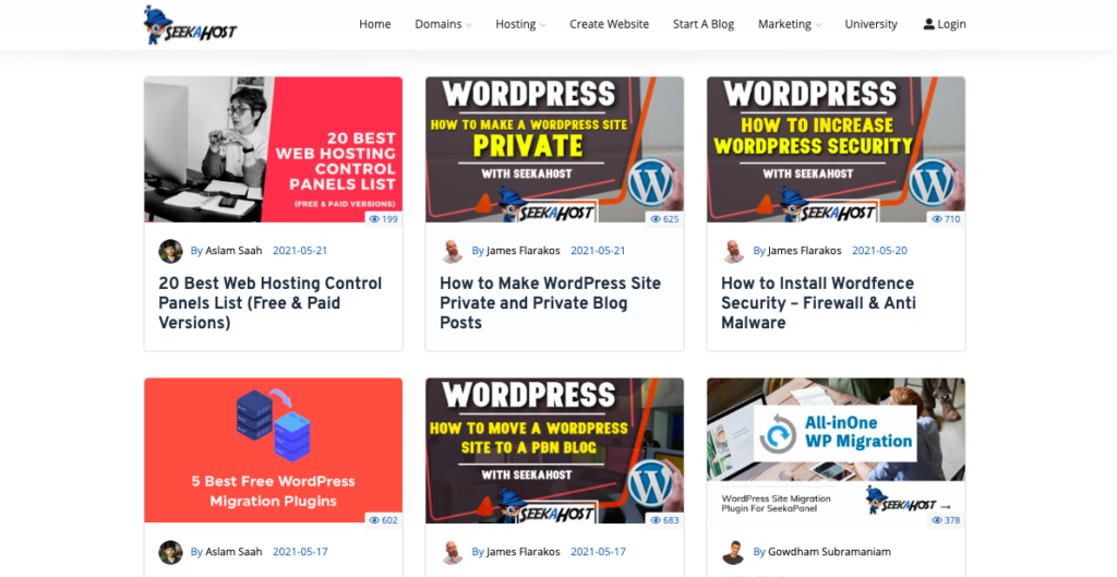
The place on the website where you find a menu with internal links to other pages is called a website navigation menu. The website navigation menu could be on the top bar or in the header. These two places are considered to be user-friendly as they are clearly visible.
The most popular pages that you can find in the header of any WordPress site are Home, About Us, Product/Services, Blog, Contact, Features, and Pricing.
Why Is Navigation Important on a Website?
Easy navigation to your website is important so that visitors can easily reach the right webpage they are looking for. With the correct navigation structure, your site bounce rate will reduce leading to an increase in traffic and conversions.
There are three types of navigation viz. Global, Hierarchical, and Local website navigation. Now let’s not divert our topic and jump to the main section of this article. Here are some key improvements that you should consider to improve your WordPress website navigation.
Clutter-free Design
Test your website design and keep it simple because simple is better. With a simple and easy-to-navigate design, users can easily find the internal page links without any distractions.
Trying too much to appeal to your visitors might harm your site design and will be cluttered. If you have a clutter-free design, visitors’ engagement will increase, thus increasing the conversion.
Placing your elements in a hierarchy helps your visitors understand the WordPress website navigation structure. Power mapper is one such tool that helps you in the visual mapping of your site.
One more thing to keep in mind for a clear design is the color combination. The color of the WordPress theme can be changed. So, try to keep the header or the top bar color light with dark menu fonts or vice versa.
So, the thumb rule for a good WordPress website navigation is to have a clear design.
Use Breadcrumbs
 Breadcrumbs help visitors to go back to the link or page from where they emerged. If you have a lot of pages, using breadcrumbs will help visitors find their way back instead of juggling around.
Not just the users, but even the search engines can understand the hierarchy of links on your webpage. To add breadcrumb navigation to your WordPress site, you can use the Breadcrumb NavXT plugin.
If there are too many pages, especially eCommerce websites, then having a breadcrumb will ease the navigation process.
Optimize the Navigation bar
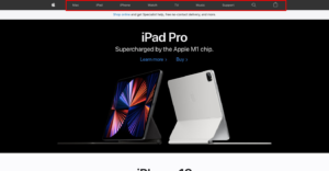 As already discussed, the navigation bar should be clutter-free. So, keep in mind that the navbar should not be flooded. Limit the menu items to up to 6 or 7, and not more than that. If there are too many menu items, you should prefer a Mega Menu instead of a bulky drop-down menu.
A Mega Menu allows the user to hover over the menu and see all the different sub-categories.
Too many menu items in the navbar look messy and confuse the visitor. If you don’t optimize the navigation bar, you are likely to lose a visitor.
You can create a sticky navbar so when a user scrolls down the webpage, it will still be visible. The sticky navbar helps users to navigate to the specific page without going up again.
Contact Information
The contact page is the most important page and the link has to be shown in the navigation bar. How will a visitor contact you with no contact information?
In WordPress, it is quite easy to create a contact form and a Contact us page. Using WPForms or Contact Form 7 plugin, you can create a simple contact information form and gather user’s information.
The user will enter an email address and type in a message in the message box, then hit send. Upon receiving the email, you can reply to the user as now you have the sender’s email address.
Mobile Responsiveness
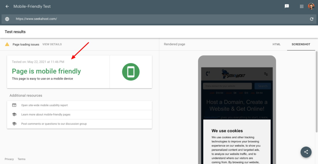
 Choose a WordPress theme that is mobile responsive and looks clutter-free on every device. While customizing the website theme, you can preview the changes on desktop, mobile, and other devices.
Ensure that the changes you have done look the same on every device and then hit publish. So, when you add the menu bar, preview its responsiveness for mobile phones, and then go ahead.
The number of mobile users has increased tremendously, hence you can’t neglect this crucial point. Things look different on mobile compared to desktop. So, you need to optimize the navbar for mobile.
For the mobile menu, you can show a hamburger icon at the top right or left of the mobile screen. You can add the text “menu” for easy understanding of the users.
Fix Broken Links
Broken links show 404 error pages and make visitors leave the page. If you have a large website, you will have multiple internal as well external links. It might be difficult to check each of the links individually.
To ease out the process, you can use WordPress plugins for broken links like Broken Link Checker. Using this plugin, you can check pages, posts, comments, directories, etc for broken links.
Conclusion
I hope these tips would be helpful in improving WordPress website navigation. The result would be surprising as you will see an increase in the number of visitors and conversions.
If you find these 6 ways to improve your WordPress website navigation informative, then do share them with others.

